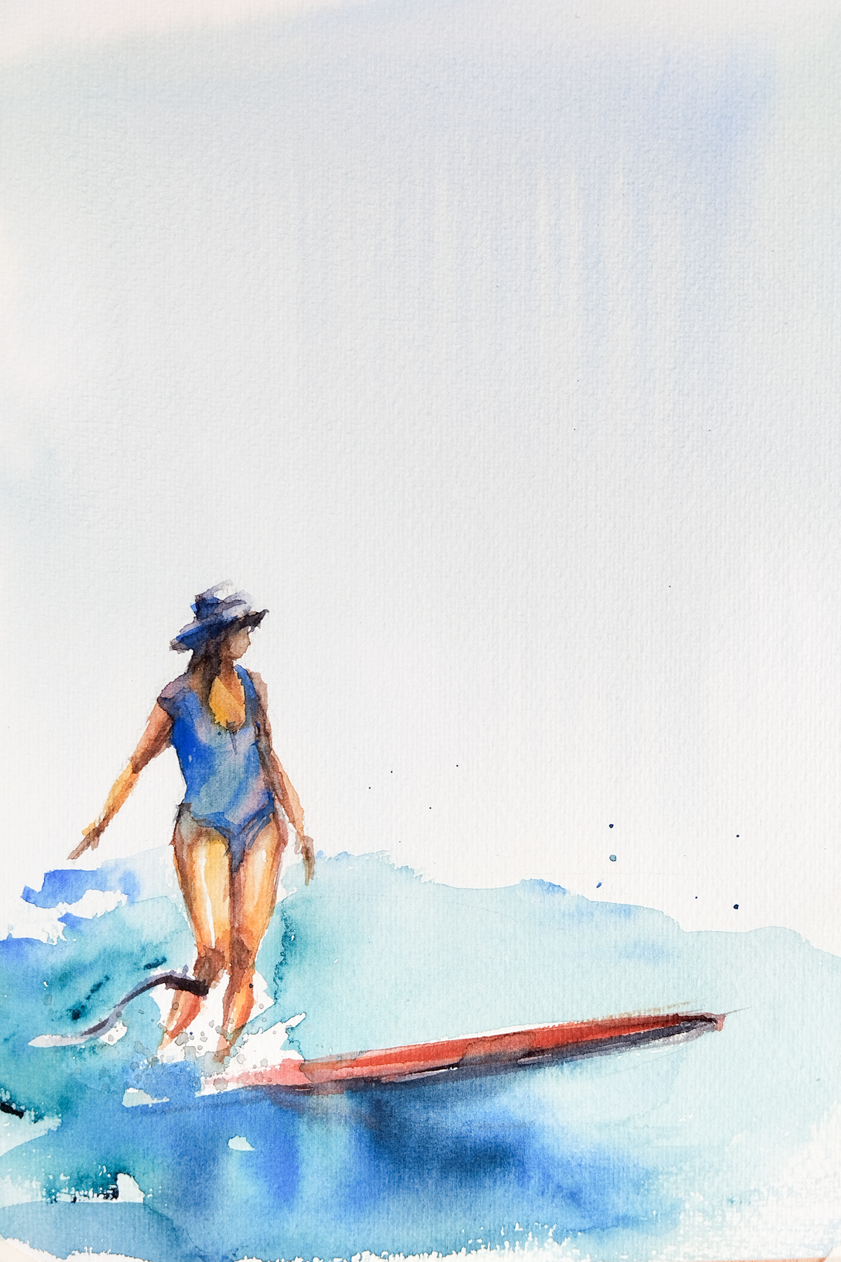
If you spend enough time at any surf break, you’ll eventually spot him. He’s the guy who looks like he’s not paying attention, totally relaxed and seemingly indifferent to the chaos of the lineup. But the second he turns for a wave, everything changes. No frantic paddling, no wasted energy, just pure style.
I’ve spent the last few sessions (both in the water and at my desk) trying to translate that specific “flow” onto paper.
The Search for the Vibe
Capturing a feeling is often harder than capturing a likeness. I made several studies where I was wrestling with the balance of the piece. I wanted the sky to hold that warm, hazy glow of a fading afternoon and the water to feel deep, transparent, and alive with emerald and turquoise tones.
The Final Illustration
In this final version, I focused on the posture, the calm, upright stance that makes longboarding look like a dance. Watercolor is the perfect medium for this; its natural fluidity mirrors the unpredictable nature of the ocean. I have to guide the paint, but I also have to let it breathe, much like finding the right line on a wave.
To the Stylists Out There
This piece is a tribute to the surfers who remind us that it’s not about how many turns you make, but how you feel while making them.
And if that guy is you… this illustration is for you.
Technical Details
Medium: Original hand-painted watercolor.
Inspiration: Late afternoon sessions and the “effortless” local legends.
Palette: Golden Yellow, Burnt Orange, Emerald Green, and Cobalt Turquoise.
What do you think of the final result? Does it capture that flow feeling, let me know in the comments!
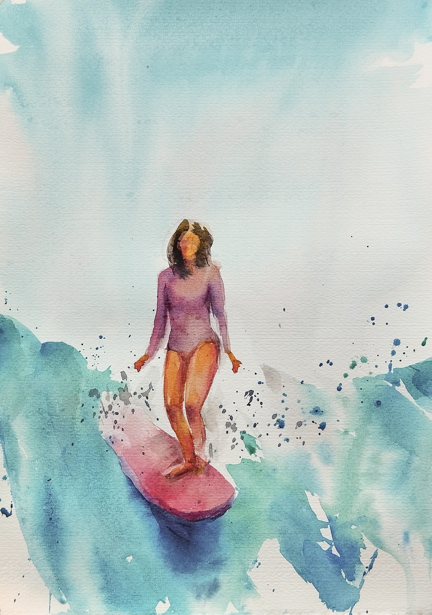
The moment when a surfer rises on the wave, the world falls away. There is no past, no future, only now. This is what i’ve sought to capture in this watercolor: a study in presence, where everything else dissolves into irrelevance, and only the breath, the body, and the ocean remain.
The Dance of Concentration
When you stand on a wave, you cannot think, everything is instinct. You can only be. And this is precisely what makes the surfer’s moment so close to meditation.
This piece explores that sacred space where concentration becomes so complete that all distraction vanishes. The surfer exists in absolute presence, her awareness narrowed to a single point: the dance between herself and the water beneath her feet.
The Colors
The palette is intencional. The water flows in emerald green and turquoise blue — luminous tones that suggest the ocean’s clarity and its movement. These jewel tones create a soft meditative quality.
Against this, the surfer is painted in cadmium yellow and hints of scarlet red — warm, vital colors that anchor her. The contrast is stark, intentional: she is present, alive, here, while everything else melts into the abstraction of water and light.
The Language of Watercolor
Watercolor is the perfect medium for this. Its transparency and lightness mirror the very nature of water itself. Nothing is forced, nothing is solid. The pigment flows and mingles, just as the waves and the ocean currents. There is no room for rigid control here, only surrender to what emerges.
Notice how the colors bleed and dissolve at the edges — this is not imperfection. It is the world beyond the moment, rendered abstract and irrelevant. The surfer’s form remains sharp, intentional, real, while everything else becomes suggestion, shadow, breath.
An Invitation to Stillness
This is what I believe at IVOILUSTRA: that presence is a practice, and that the ocean teaches it better than any philosophy. In this watercolor, I offer an invitation to step into that moment where thinking stops and being begins.
The wave teaches. The surfer listens. The moment is all there ever was.
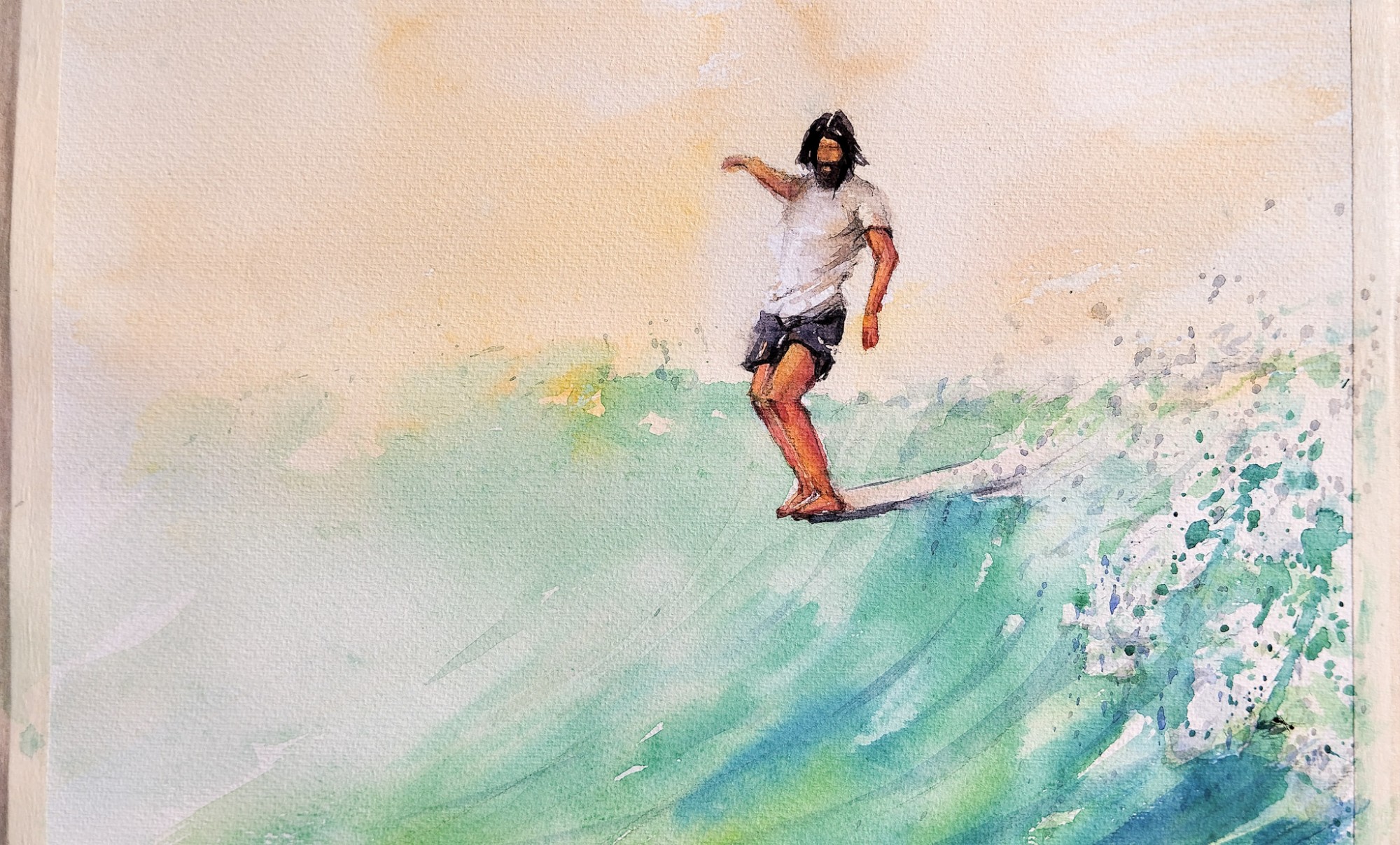
The Grace in Flow represents the unique dance of longboarding surf… It’s not about speed or power; it’s about timing, grace, and moving in rhythm with the wave’s heartbeat. In this third installment of the Earth Tone Collection, I wanted to celebrate the feminine energy of the ocean—a presence that is both strong and incredibly fluid. Like a dance.
As with the rest of this series, the challenge was to convey this sense of light and movement using only Raw Sienna and Sepia.
Capturing the timeless elegance of a hang ten through the warmth of Raw Sienna.
The Contrast of Stillness and Spray
In this illustration, the focus shifts to the silhouette.
The Silhouette: By using a deeper concentration of Sepia for the surfer’s figure, I created a strong contrast against the hazy, sun-drenched background. This emphasizes the poise of the “cross-step”—that suspended moment of perfect weightlessness.
Warmth over Blue: Why no blue?The Raw Sienna wash isn’t just representing a sunset; it represents the feeling of the sun on your skin while you glide.
Moving with Grace
I believe that art should be a window into a lifestyle. This piece serves as a reminder that even when the world feels chaotic, we can choose to move through it with grace. It’s about finding the beauty in the ride.
This illustration is dedicated to the dreamers and the “soul surfers” who find their peace on the nose of a board.
Bring the “Grace” Home
Decorating your home with art that has a story brings a different energy to your space. This piece isn’t just a “surf poster”; it is a reminder to find your own “grace” in the flow. Complement your space with the serene energy. Worldwide shipping.
I’ve always felt that two or three small illustrations often capture a mood more deeply than a single large piece. This collection is a narrative of the surfing life, a state of mind and a way of being. By bringing these pieces together, you create a cohesive story of the ocean and surf culture on your wall. If this resonates with you, you can find the complete collection here.
In surfing, “the pocket” is the most powerful part of the wave—the place where energy is most intense. Yet, to ride it well, you must find a center of calm. This second piece in the “Earth Tone Collection” captures that exact paradox: the frantic spray of the Atlantic meeting the quiet focus of the rider. Continuing with the minimalist philosophy of this collection, I wanted to translate the feeling of the ride through texture and tone.
A meditation on movement and stillness using the raw textures of Raw Sienna and Sepia.
Painting the Invisible Spray
Capturing the “spray” (the water thrown by the wave) using only Sepia and Raw Sienna was a technical journey.
Negative Space: I used the white of the paper to represent the light hitting the water droplets.
Granulation: By allowing the pigments to settle naturally, I recreated the organic, sandy feeling of our coastline—the raw essence of the Portuguese “Golden Hour.”
Philosophy: Moving with the Flow. The surfer in this illustration isn’t fighting the wave; he is part of its geometry. This reflects a core value: Presence.
Whether you are in the ocean or navigating a busy day in the city, finding your “pocket of silence” is essential for balance.This piece is designed for those who value the quiet moments of mastery—the subtle art of moving through life with focus, grace and intention.
Bring the Balance Home
Decorating your home with art that has a story brings a different energy to your space. This piece isn’t just a “surf poster”; it is a reminder to find your own “center” and go with the flow. Complement your space with the serene energy of the “Pocket of Silence.” Worldwide shipping.
I’ve always felt that two or three small illustrations often capture a mood more deeply than a single large piece. This collection is a narrative of the surfing life, a state of mind and a way of being. By bringing these pieces together, you create a cohesive story of the ocean and surf culture on your wall. If this resonates with you, you can find the complete collection here.
There is a specific moment during a sunset surf session where the world seems to hold its breath. The water turns into liquid gold, and for a few seconds, you aren’t just riding a wave—you are part of it.
At IvoIlustra, my philosophy has always been about “Slow Living” and the deep connection between the human spirit and the ocean. In this watercolor piece, I wanted to explore the concept of Total Surrender.
How a limited palette of Raw Sienna and Sepia captured the soul of surf.
The Power of a Limited Palette
Can we paint water using earth tones?
To evoke the warmth of the sun without the distraction of bright colors, I challenged myself to a minimalist approach. I put away the blues and greens, choosing instead a duo of earth pigments:
Raw Sienna: To capture the glowing, transparent light of the setting sun.
Sepia: To provide the depth, shadows, and the raw texture of the spray.
By stripping back the color, the emotion becomes the protagonist. This technical choice reflects the “Less is More” lifestyle— focusing on the essentials to find true beauty.
The Surrender to the “now”
The central figure of this illustration is a surfer with arms wide open. In the world of surf, we often focus on the maneuver or the size of the swell. Here, the focus is the internal state.
The open arms are a universal symbol of:
Gratitude: Acknowledging the power of nature.
Presence: Being fully “in the now,” where time stops.
Vulnerability: Trusting the ocean and the flow of the wave.
Why Choose Fine Art Surf Decor?
Decorating your home with art that has a story brings a different energy to your space. This piece isn’t just a “surf poster”; it is a reminder to find your own “moment of surrender” in your daily life, even when you are far from the coast.
All my prints are created using sustainable practices and high-quality paper to ensure that the texture of the original watercolor is preserved for years to come.
Bring the Golden Hour Home
If you feel a connection to this moment of surrender, you can now bring a piece of it into your own space. This illustration is available as a high-quality Fine Art Print, captured on textured paper to preserve every drop of Raw Sienna and Sepia.
I’ve always felt that two or three small illustrations often capture a mood more deeply than a single large piece. This collection is a narrative of the surfing life, a state of mind and a way of being. By bringing these pieces together, you create a cohesive story of the ocean and surf culture on your wall. If this resonates with you, you can find the complete collection here.
There’s a particular kind of longing that surfers know well. The one that hits you on a grey Tuesday morning, far from the ocean, when the only waves you can see are in your memory. Good surf art doesn’t decorate a wall — it keeps that feeling alive.
After years painting the ocean from the inside — from a van parked above the Atlantic, watching swells form on the horizon — I’ve come to believe that the best surf art prints are the ones that capture a feeling, not just an image. Here’s what I look for, and what I create.
What Makes a Great Surf Art Print?
Not all surf art is equal. A photograph captures a moment. A watercolor painting captures something harder to name — the weight of water, the translucency of a curling lip, the way light breaks through a wave at the exact second before it does. That’s what makes watercolor the natural medium for surf art. It moves. It breathes. It’s never fully in control, just like the ocean itself.
When choosing a surf art print for your home, look for these qualities:
Movement over perfection — the best surf prints have energy, not polish
Color honesty — ocean blues are never one shade; look for prints that show the full range
Paper quality — a 200gsm matte surface holds color longer and won’t fade the memory
A story behind it — art made by someone who actually surfs carries something that stock imagery never will
The Best Surf Art Prints for Every Space
For a Small Wall or Desk — A5 Watercolor Print
Not every surf art piece needs to dominate a room. Some of the most powerful ones are small, quiet, and placed exactly where you’ll see them first thing in the morning. An A5 watercolor print — 15×20 cm — is perfect for a desk corner, a bedside table, or a small kitchen shelf. It’s art that travels with you.
My Surf Art Poster A5 is printed on premium 200gsm matte paper from the original watercolor painting — the one I finished after a long morning session at a beach I won’t name, because some spots deserve their mystery.
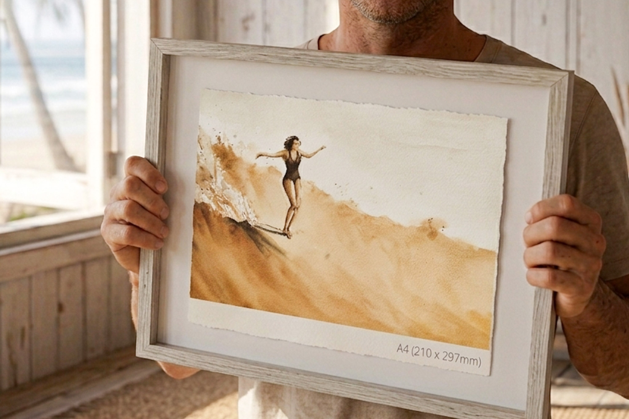
For a Statement Wall — A4 Print
If you want the ocean to really fill a room, step up to A4. The extra size lets the watercolor do its full work — the gradients, the loose brushstrokes, the unpredictable edges that make each print feel like a one-off even if it isn’t.
My Surf Art Poster A4/A5 works equally well alone or as part of a gallery wall. I often see it paired with a wooden frame — natural wood against ocean watercolor is a combination that never fails.
For a Complete Surf-Inspired Space — The 2026 Calendar
Twelve months, twelve original illustrations. The 2026 IVOILUSTRA Calendar is designed with perforated pages specifically so you can tear them off and frame them. By December you’ll have twelve pieces of surf art for the price of one.
It’s printed on FSC-certified 200gsm matte paper, 21×21 cm square. Minimalist enough to work in any modern interior. Atlantic enough to take you somewhere else entirely.
How to Hang Surf Art Prints at Home
A few principles I’ve picked up from watching people live with my art:
Eye level is a myth — hang surf art slightly lower than you think, especially if you’ll be sitting near it
Group in odd numbers — three small prints together have more presence than one large one
Let it breathe — surf art needs space around it, just like a good wave needs a clean face
Natural frames — oak, pine, or bamboo frames match the organic quality of watercolor better than black metal
Why Prints by Surfer Artists Hit Differently
I started painting the ocean because I couldn’t stop thinking about waves when I wasn’t in them. The van became my studio because the studio needed to be close to the water. Every illustration in my shop began as a pencil sketch in a notebook that’s been wet more times than it should — then became a watercolor on a board balanced on my lap, then became a print that someone hangs in their home far from the sea.
That journey matters. It’s what separates surf art made by surfers from surf art made for surfers.
If you’re looking for the real thing — the shop is here. Worldwide shipping, printed on premium paper, and every piece started with salt water somewhere in the process.
The 2026 IVOILUSTRA Calendar is now available in the shop — and it might be the piece I’m most proud of bringing into the world this year.
The idea was simple: take the 12 illustrations that resonated most with the community over the past years — the waves, the figures, the light on moving water — and bring them together into a single collector’s object. One painting for each month. A whole year of original watercolour surf art on your wall.
Each illustration was chosen by the people who follow this work. These are the pieces that generated the most messages, the most shares, the most “I need this on my wall” — so in a real way, you curated this calendar. I just painted it.
🗓️ 12 original watercolour illustrations — one per month
🎨 Surf art & ocean watercolour — the best of the IVOILUSTRA archive
📄 Perforated pages — tear off each month and frame it directly on your wall
📐 21×21 cm square format — minimalist design that fits any modern interior
🌿 FSC-certified 200gsm matte paper — premium quality, sustainably sourced
🌍 Worldwide shipping — delivered in 4–9 days
The perforated pages are my favourite detail. By December, you won’t just have used a calendar — you’ll have twelve individual art prints ready to frame. It was designed to live on your walls long after 2026 is over.
Whether it’s for yourself or as a gift for someone who loves the ocean, this is a beautiful way to bring original watercolour art into everyday life — one month at a time.
There’s a version of watercolour painting that’s careful, measured, planned. The reference photo pinned up, the composition sketched out, the colours mixed and tested before touching paper. I do that version too.
But the version I come back to every day — the one that keeps me sane, keeps me honest, keeps me improving — is the other one. No reference. No goal. Just pigment, water, and whatever my hand decides to do.
Sketching freely with watercolours, without thinking about the result, is an inexplicable pleasure. It’s also, I’ve come to believe, the most important practice a watercolour artist can have. Not the commissions, not the finished pieces. This — the daily loose sketch. My meditation.
Why Loose Sketching Makes You a Better Artist
When there’s nothing at stake — no client, no finished piece, no Instagram post planned — your hand starts to move differently. More honestly. The marks you make when you’re not trying to impress anyone are often the most interesting marks you’ll ever make.
Loose watercolour sketching builds the muscle memory that makes confident painting possible. The instinct for how much water to load onto a brush, how far a pigment will bleed, when to stop. These aren’t things you can think your way into. They come from repetition — and the most painless repetition is play.
The Practice
My daily sketch has almost no rules. Wet the paper or don’t. Pick colours that feel right, not colours that are correct. Let shapes emerge rather than drawing them first. If it fails, turn the page. There are no failed sketches in a practice journal — only information.
Most of my best ideas for finished paintings came from these sessions. A colour combination that surprised me. A mark that suggested a wave I hadn’t thought to paint. The loose sketch is where the unconscious gets a say.
If you paint — or want to start — this is the one habit I’d recommend above everything else. Fifteen minutes a day, no pressure, no audience. Just you, a brush, and whatever the water decides to do.
The prints in my shop are the finished, considered versions. But they all started somewhere close to this.
Winter on the Portuguese Atlantic coast is beautiful in its own way — heavy, grey, powerful. The swells come in big and the water is cold enough to clear your head in seconds. But it demands something from you. Every session feels earned.
Spring is different. The light softens. The swell direction shifts and the waves become longer, cleaner, more forgiving. The kind of waves that make longboarding feel like dancing — slow, deliberate, every step on the board a choice you have time to make.
This illustration was painted in that spirit — the anticipation of spring surf, the lightness of a clean wave on a morning when the wind hasn’t woken up yet. Soft colours, movement without force, the hat brim catching the first warm light of the season.
Surf Art Inspired by the Seasons
One of the things I love most about living close to the ocean is that the water is never the same. Every season changes not just the waves but the palette — the winter blues are deep and cold, the spring greens are translucent and warm, the summer light turns everything gold by late afternoon.
These shifts end up in the paintings whether I plan them or not. Watercolour responds to mood, and mood responds to the ocean. This piece is spring on the Atlantic — hopeful, gentle, and just a little bit restless.
Sending good vibes to everyone waiting for their season to start. It always comes back. 🌊
Browse all surf art prints at ivoilustra.com/shop — worldwide shipping, delivered in 4–9 days.
Praia do Estoril doesn’t get talked about the way Ericeira or Nazaré do. It’s not a big-wave spot. It doesn’t have a world-famous reef. What it has is something harder to find: consistency. When the wind and the swell align, Estoril delivers a long, peeling wave that runs down the beach in a way that feels almost too good to be real.
It’s a longboarder’s wave. Patient, readable, generous. The kind that lets you walk to the nose, hang five, turn back, and do it again before the wave finally gives out in the shallows. I surfed it one afternoon when everything clicked — and came home and painted it before the feeling left my body.
Painting the Wave While the Memory Was Still Fresh
This is how most of my surf illustrations start: in the van, immediately after a session, with the memory of the wave still physically present. The paddling fatigue in the shoulders. The salt still on the skin. That state is the best reference a watercolour artist can have — not a photograph, but a felt memory.
The figure in the painting is riding with that particular longboard ease — upright, unhurried, reading the wave rather than fighting it. That’s what Estoril does to you. It slows everything down and makes the ocean feel approachable again.
The short video below shows the painting coming together — from the first wash to the final marks.
I have a feeling there’s a lot more to come from this stretch of coast. The Atlantic doesn’t run out of waves. And I haven’t run out of reasons to paint them.
Prints available in the shop — worldwide shipping, 4–9 days. More process videos on YouTube.
To provide the best experiences, we use technologies such as cookies to store and/or access device information. Consenting to these technologies will allow us to process data, such as browsing behavior or unique IDs on this website. Not consenting or withdrawing consent may negatively affect certain features and functions
Funcional
Always active
O armazenamento ou acesso técnico é estritamente necessário para o fim legítimo de permitir a utilização de um determinado serviço expressamente solicitado pelo assinante ou utilizador, ou para o fim exclusivo de efetuar a transmissão de uma comunicação numa rede de comunicações eletrónicas.
Preferências
O armazenamento ou acesso técnico é necessário para o propósito legítimo de armazenamento de preferências não solicitadas pelo assinante ou utilizador.
Estatísticas
O armazenamento técnico ou acesso que é usado exclusivamente para fins estatísticos.O armazenamento técnico ou acesso que é usado exclusivamente para fins estatísticos anónimos. Sem uma intimação, conformidade voluntária por parte do seu Fornecedor de Serviços de Internet ou registos adicionais de terceiros, as informações armazenadas ou recuperadas apenas para esse fim geralmente não podem ser usadas para identificá-lo.
Marketing
O armazenamento ou acesso técnico é necessário para criar perfis de utilizador para enviar publicidade ou para rastrear o utilizador num site ou em vários sites para fins de marketing semelhantes.